Annotations & Styling
QuickPose provides high definition annotations at a minimal performance cost.
| Points | Overlay | Measuring Line | Range Of Motion |
|---|---|---|---|
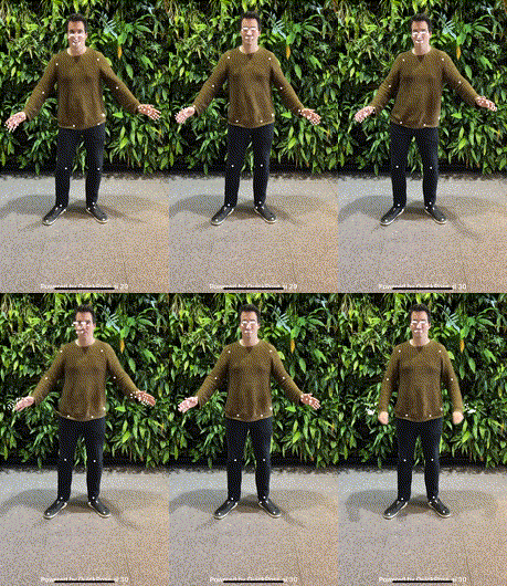 | 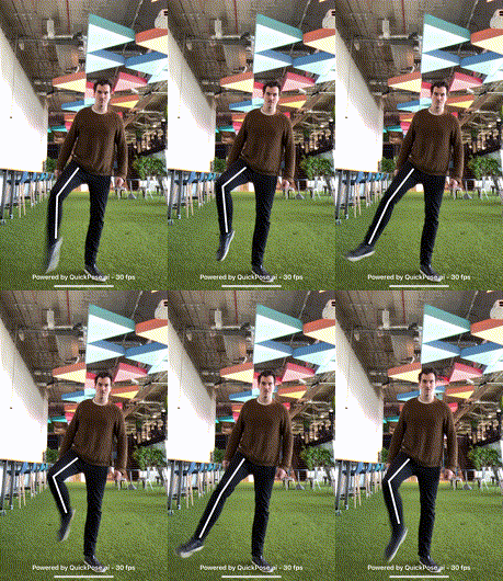 | 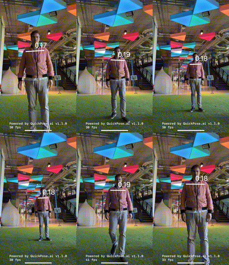 | 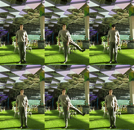 |
As annotations provide important visual feedback to your users, quickpose defaults to display an annotation for every feature.
There are cases where the body overlay is not automatically drawn:
| Exercise Guide | Inside Box |
|---|---|
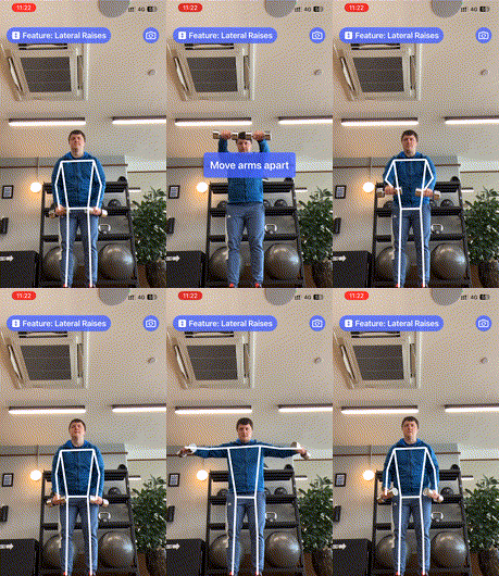 |  |
In the Exercise Guide example, when the user is not standing or performing a move correctly, the body overlay is turned off, providing a visual clue to the user's mistake and does not draw focus from the feedback message "Move arms apart" shown in an overlay.
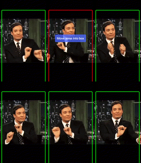
For Inside Box, developer's have to choose whether to implement the skeleton whilst the user is not in the correct position.
Points
This feature visualizes what landmarks have been found by the underlying ML model.
case showPoints()
case showPoints(style: customStyle) // with a custom style
Use this feature when changing the model complexity, for example for performance tuning, as some model versions don't track the face and hands in the same resolution, so whilst you may get a faster frame rate you may be losing key landmarks you need for your app to work.
Overlays
Whilst overlays are returned in overlay image, they don't provide a numeric result. These are intended to provide visual feedback to the user, and are often included in higher level features such as range of motion or fitness features.
case overlay(feature: Landmarks.Group)
case overlay(feature: Landmarks.Group, style: customStyle) // with a custom style
Overlays accept a landmark group:
case none
case wholeBody
case wholeBodyAndHead
case upperBody
case straightArmsUpperBody
case toWristsUpperBody
case shoulders

case arm(side: Side)
case armToWrist(side: Side)
case armNoElbow(side: Side)
case straightArm(side: Side)
case hand(side: Side)
case leg(side: Side)

case lowerBody
case hips
case elbows
case knees
case legs
case arms
case head
Style Reference
Every feature accepts a Style, which controls how its lines, points, arcs and labels are drawn:
| Property | Default | Effect |
|---|---|---|
color | white | Color of lines, points, arcs and labels |
conditionalColors | none | Replaces color when the feature's measured value is in a given range — see Conditional Styling |
relativeLineWidth | 1.0 | Line thickness, relative to the default width |
relativeFontSize | 1.0 | Measurement label size; 0 hides the label |
relativeArcSize | 1.0 | Radius of range-of-motion angle arcs |
relativePointSize | 1.0 | Size of the landmark dots drawn by the Points feature |
lineCap | round | Shape of line endings and joins: round, butt or square |
linePattern | solid | solid, dashed or dotted lines |
shadow | none | Drop shadow or glow behind the overlay |
outline | none | Contrasting border behind lines and points |
imageFill | none | Image revealed through the skeleton's lines and points |
font (iOS) / typeface (Android) | system | Font face for measurement labels |
letterSpacing | 0 | Label letter spacing in ems (fraction of text size) |
cornerRadius | 0 | Corner rounding of the Inside Box border |
hidden (iOS) | false | Draws nothing while still reporting results |
See Styling Options for the visual options in action.
lineCap, linePattern, shadow, outline, imageFill, font/typeface and letterSpacing are available from v1.3.0 (iOS) and quickpose-core 0.22 (Android).
relativePointSize is available from v1.6.0 (iOS) and quickpose-core 0.24 (Android).
Customizing annotations
To specify a smaller line width set a relativeLineWidth:
- Swift
- Kotlin
- React Native
let smallerStyle = QuickPose.Style(relativeLineWidth: 0.33)
let feature1: QuickPose.Feature = .overlay(.upperBody, style: smallerStyle)
val smallerStyle = Style(relativeLineWidth = 0.33f)
val feature1 = Feature.Overlay(Landmarks.Group.UpperBody(), style = smallerStyle)
<QuickPoseView
  features={['overlay.upperBody']}
  featureStyles={{'overlay.upperBody': {relativeLineWidth: 0.33}}}
/>
The style entries are relative to the original drawn size, so this will be 1/3 of the size of the default line width.
To shrink the angle markers of a range of motion measurement override relativeArcSize and relativeFontSize, as the rangeOfMotion renders text on screen.
- Swift
- Kotlin
- React Native
let smallerStyle = QuickPose.Style(relativeFontSize: 0.33, relativeArcSize: 0.33, relativeLineWidth: 0.33)
let feature1: QuickPose.Feature = .rangeOfMotion(.shoulder(side: .right, clockwiseDirection: false), style: smallerStyle)
val smallerStyle = Style(relativeFontSize = 0.33f, relativeArcSize = 0.33f, relativeLineWidth = 0.33f)
val feature1 = Feature.RangeOfMotion(RangeOfMotion.Shoulder(Side.RIGHT, clockwiseDirection = false), style = smallerStyle)
<QuickPoseView
  features={['rangeOfMotion.shoulder.right']}
  featureStyles={{'rangeOfMotion.shoulder.right': {relativeFontSize: 0.33, relativeArcSize: 0.33, relativeLineWidth: 0.33}}}
/>
If you would like to see no annotations for your feature set the hidden value to true
let hiddenStyle = QuickPose.Style(hidden: true)
let feature1: QuickPose.Feature = .overlay(.upperBody, style: hiddenStyle)
However, we don't recommend this approach as annotations give the user feedback that they are visible to the camera, and what is expected of them,
Styling Options
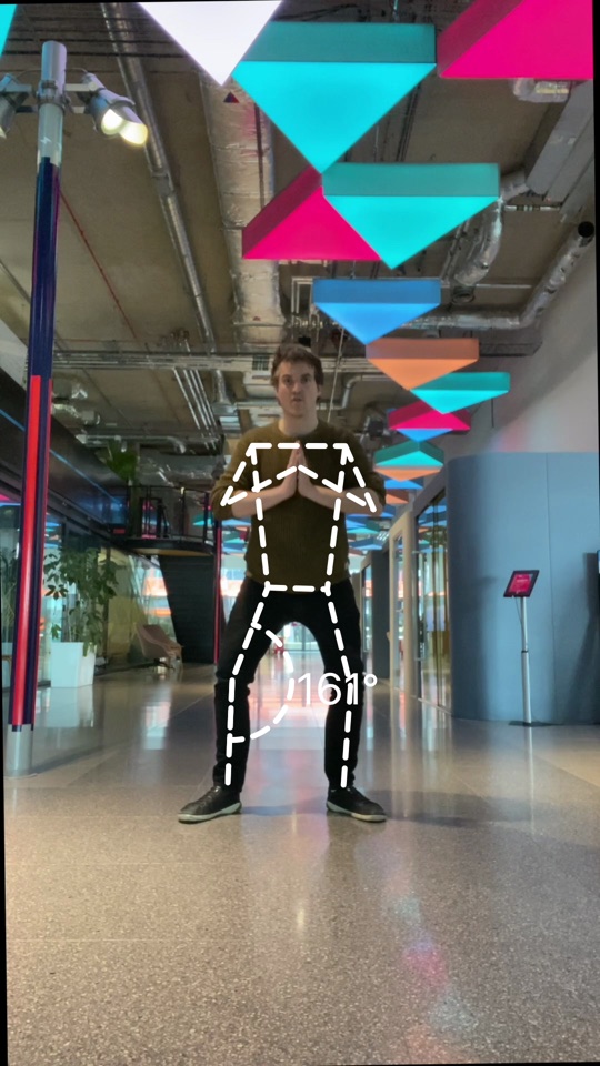
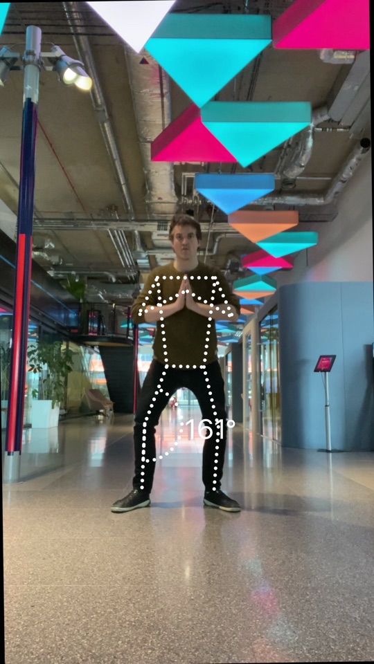
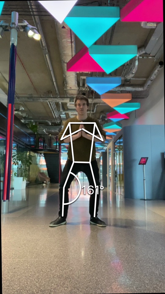
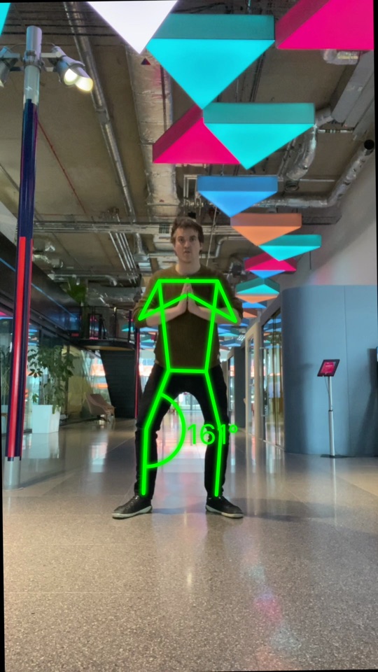
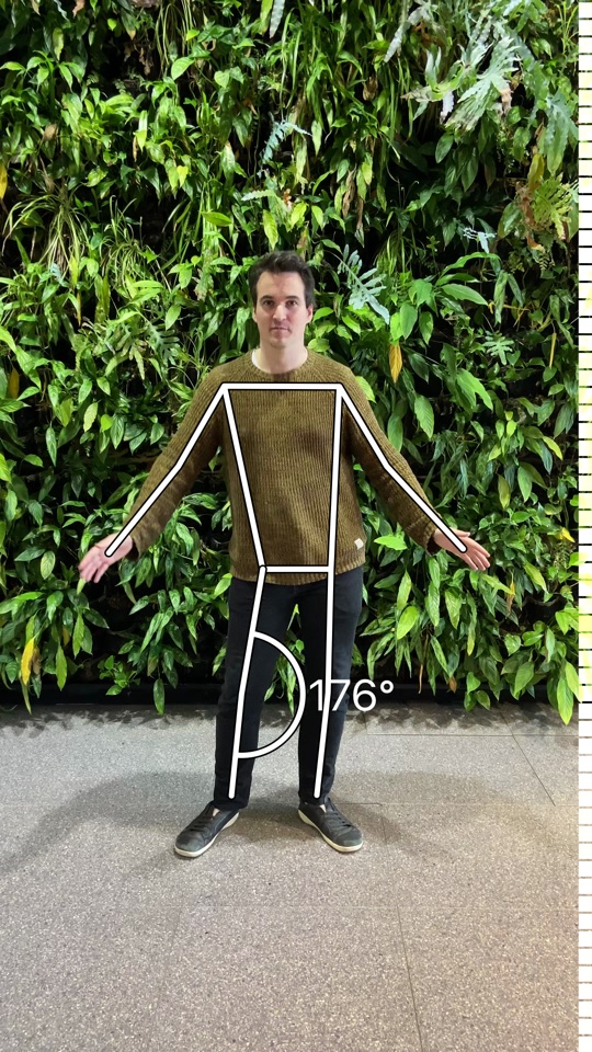
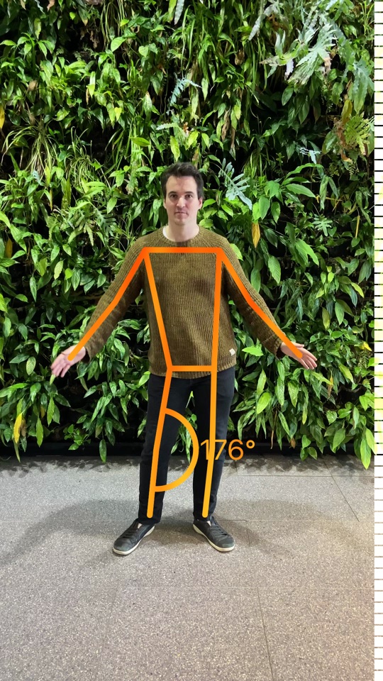
All the visual options combine freely — caps, patterns, shadows, outlines and image fills are independent Style parameters that compose in a single style:
lineCap: .round (default) | lineCap: .butt | linePattern: .dashed | linePattern: .dotted |
|---|---|---|---|
 |  |  |  |
shadow | shadow as glow | outline | imageFill |
|---|---|---|---|
 |  |  |  |
combined: outline + shadow + dashed | imageFill + outline | custom font |
|---|---|---|
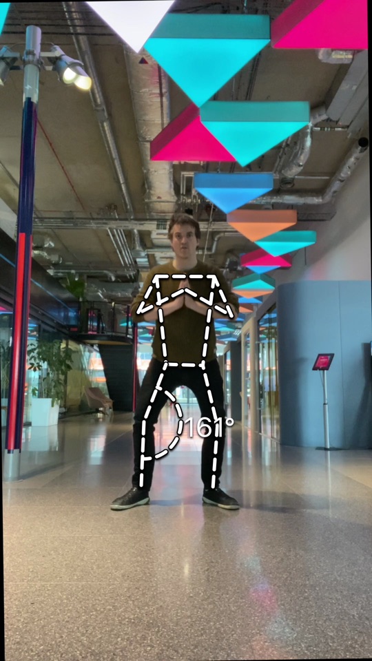 | 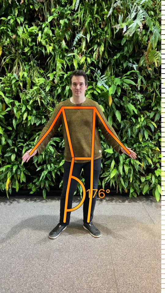 | 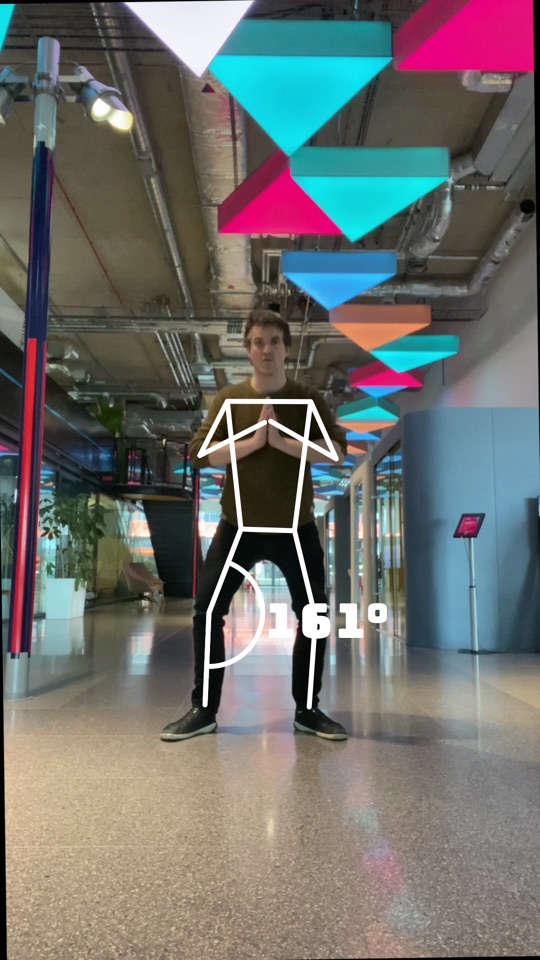 |
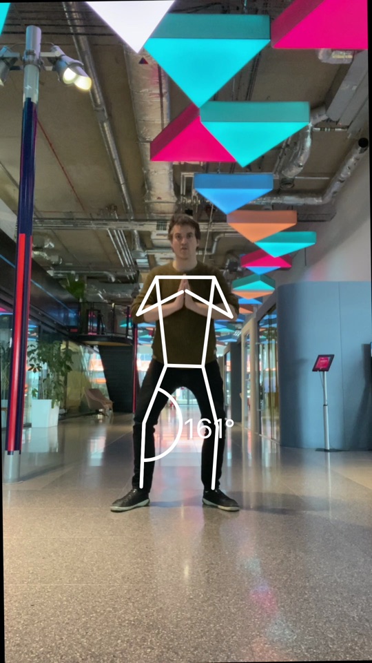
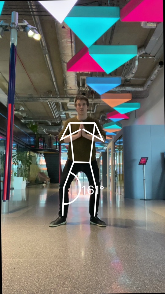
lineCap— shape of line endings and the joins between limb segments:round(default),buttorsquare.linePattern—solid,dashedordotted. Dash and dot lengths scale with the line width, so patterns stay proportionate when you changerelativeLineWidth. Dashed overlays work well for showing a target or "ghost" pose alongside a solid live skeleton.shadow— a soft shadow behind lines, points and labels.radiusis the blur size in pixels;offsetX/offsetYmove the shadow right/down on screen, consistently for front and back cameras. A shadow with no offset in the line's own color renders as a neon glow.outline— a contrasting border behind lines and points, keeping the skeleton visible whatever it is drawn over — a white skeleton on a white wall disappears without one.relativeWidthis relative to the default line width, added on each side.imageFill— the skeleton becomes a mask revealing a supplied image, scaled to fill the camera frame: lines, points and measurement labels all show the image through their shape. Use it for flame effects, gradients or brand textures. It overridescolor/conditionalColors, and a widerrelativeLineWidth(1.5–2) gives the texture room to read.font/typeface— the face used for measurement labels: anyUIFonton iOS, anyTypefaceon Android (system families, bundled fonts, or files — the image above injects Bungee from Google Fonts). It supplies the face only — label size is always 80 scaled byrelativeFontSize, so sizing behaves identically on both platforms.letterSpacing— label letter spacing in ems, the fraction of the text size added between glyphs:0.1adds 10% of the text size. Same units on both platforms.
- Swift
- Kotlin
- React Native
QuickPose.Style(lineCap: .butt)
QuickPose.Style(linePattern: .dashed)
QuickPose.Style(shadow: QuickPose.Style.Shadow(color: UIColor.black, radius: 6, offsetX: 0, offsetY: 4))
QuickPose.Style(color: UIColor.green,
                shadow: QuickPose.Style.Shadow(color: UIColor.green, radius: 14, offsetX: 0, offsetY: 0))
QuickPose.Style(outline: QuickPose.Style.Outline(color: UIColor.black, relativeWidth: 0.3))
QuickPose.Style(relativeLineWidth: 1.6, imageFill: UIImage(named: "flames"))
QuickPose.Style(font: UIFont(name: "Bungee-Regular", size: 80), letterSpacing: 0.08)
Style(lineCap = Style.LineCap.BUTT)
Style(linePattern = Style.LinePattern.DASHED)
Style(shadow = Style.Shadow(color = Color.valueOf(Color.BLACK), radius = 6f, offsetX = 0f, offsetY = 4f))
Style(color = Color.valueOf(Color.GREEN),
      shadow = Style.Shadow(color = Color.valueOf(Color.GREEN), radius = 14f, offsetX = 0f, offsetY = 0f))
Style(outline = Style.Outline(color = Color.valueOf(Color.BLACK), relativeWidth = 0.3f))
Style(relativeLineWidth = 1.6f, imageFill = BitmapFactory.decodeResource(resources, R.drawable.flames))
Style(typeface = ResourcesCompat.getFont(context, R.font.bungee), letterSpacing = 0.08f)
const styles: QuickPoseStyle = {
  lineCap: 'butt',
  linePattern: 'dashed',
  shadow: {color: '#000000', radius: 6, offsetY: 4},
  outline: {color: '#000000', relativeWidth: 0.3},
  imageFill: Image.resolveAssetSource(require('./flames.png')).uri,
  fontName: 'Bungee-Regular',
  letterSpacing: 0.08,
};

<QuickPoseView
  features={['overlay.wholeBody']}
  featureStyles={{'overlay.wholeBody': styles}}
/>
Combining a subtle outline with a soft shadow keeps the overlay legible on bright walls, dark gyms and busy backgrounds alike:
let readableStyle = QuickPose.Style(shadow: QuickPose.Style.Shadow(color: UIColor.black, radius: 4, offsetX: 0, offsetY: 2),
                                    outline: QuickPose.Style.Outline(color: UIColor.black, relativeWidth: 0.25))
Conditional Styling
QuickPose allows the annotation color to provide visual feedback on a user's movement.
| Target Range | Warning |
|---|---|
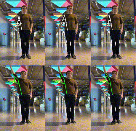 | 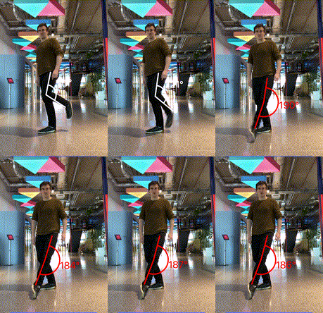 |
The above gifs demonstrate the two major use cases: displaying visually when the user has entered a target range or has entered a dangerous range. Keep in mind that target or dangerous ranges vary by user and exercise.
For conditional highlighting when the angle goes above 120 degrees use:
- Swift
- Kotlin
- React Native
let conditionalStyle = QuickPose.Style(conditionalColors: [QuickPose.Style.ConditionalColor(min: 120, max: nil, color: UIColor.green)])
let feature1: QuickPose.Feature = .rangeOfMotion(.shoulder(side: .right, clockwiseDirection: false), style: conditionalStyle)
val conditionalStyle = Style(conditionalColors = listOf(Style.ConditionalColor(min = 120f, max = null, color = Color.valueOf(Color.GREEN))))
val feature1 = Feature.RangeOfMotion(RangeOfMotion.Shoulder(Side.RIGHT, clockwiseDirection = false), style = conditionalStyle)
<QuickPoseView
  features={['rangeOfMotion.shoulder.right']}
  featureStyles={{'rangeOfMotion.shoulder.right': {conditionalColors: [{min: 120, color: '#00FF00'}]}}}
/>